We just love what y’all did for the art contest this month!
We can see you really put your hearts into it 💖💖💖 A heartfelt thank you to all who took part!
Here’s what our judge Lee White had to say about the entries:
“Hey everyone, sorry for the delay. I've been neck deep in a really tricky new book project and am just now coming up for some air! Whew!
And what a breath of fresh air it is! Your work for the contest is lovely and I spent a lot of time pouring over the images. This topic is a tricky one. It's hard not to be too cliche with the subject matter because we have been saturated with overly sentimental images for years and years. I think you guys did a good job of putting a new spin on a very well traveled topic.
I noticed a lot of new entries and I want to really encourage all of the new faces here. You are doing great! We had over 80 entries this month so I really had to sit with the images for a bit to see how they held up over to multiple viewings. I think I've managed to narrow it down to our winners and honorable mentions.
in terms of what didn't make it, here's how it broke down:
Concept being overly sentimental images or cliche: Even though many of them were sweet, just painting two people/characters interacting didn't have enough originality to win.. (still nice images though!). Need to have some kind of new twist on that to do well here.
Technique: I saw a lot of good ideas where the execution wasn't quite there yet. Keep at it, this part is the easiest to fix.”
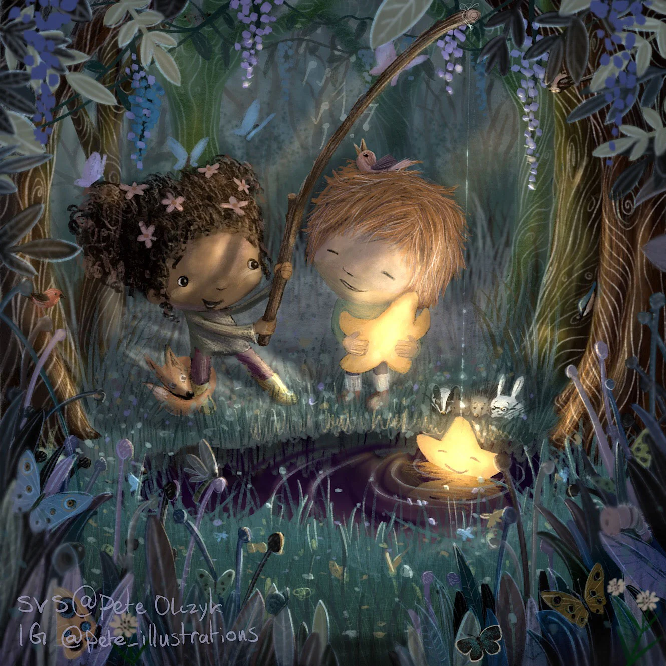
Without further ado, first place goes to Pete Olczyk, who hit all the right notes with his sweet illustration.
“Gorgeous painting here in our top spot. Great concept and absolute control in color and light. The beauty here is there is actually a LOT of detail in this, but it's all controlled so well it looks simple and sweet. Great job Pete.”
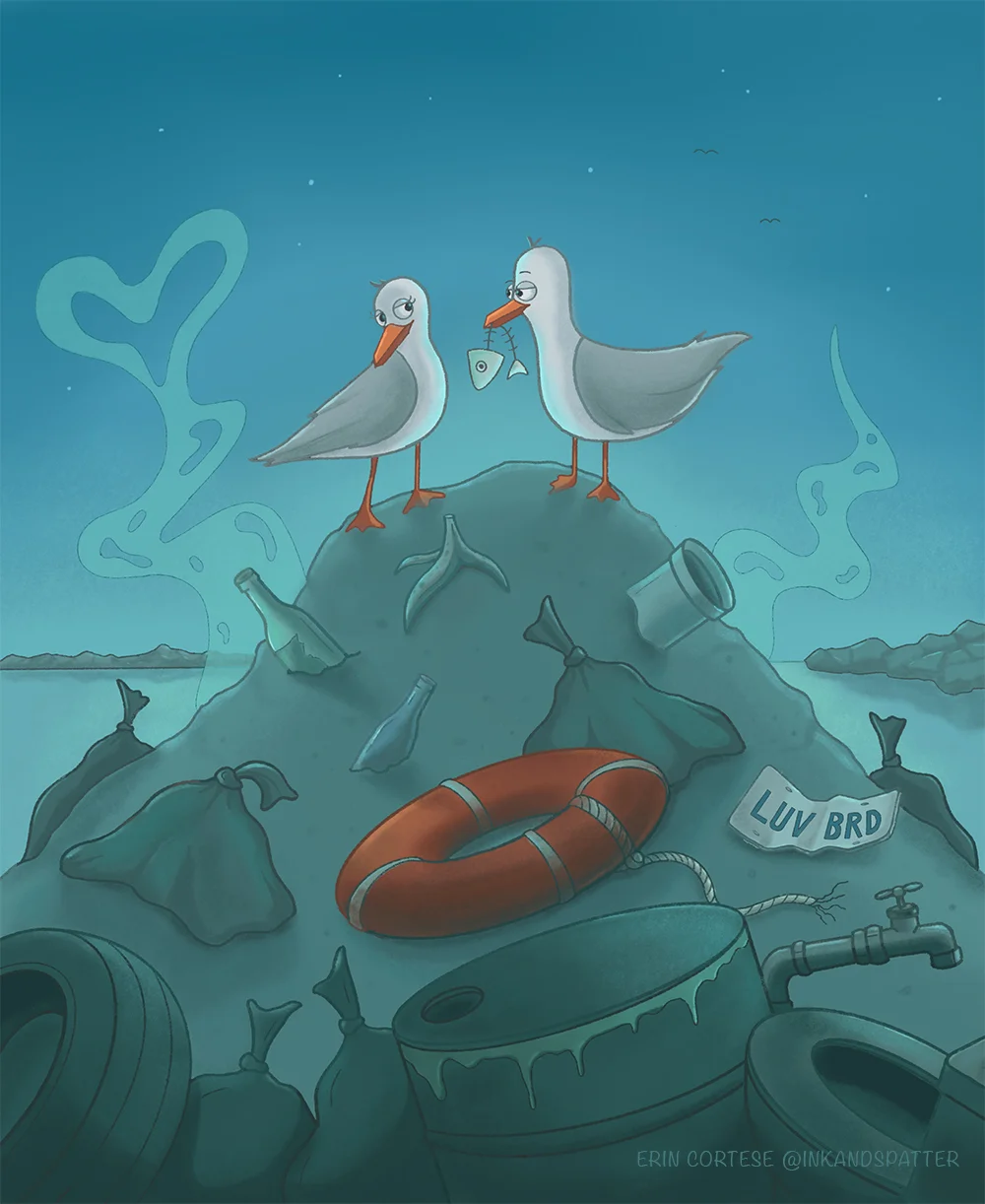
Second place goes to Erin Cortese, who cracked us up with her funny take on seagull courtship rituals.
“I love Erin's concept here. It's so funny and spot on. This is a nice way to take a cliche idea (like giving flowers to a valentine) and to spin it and make it new. The cool blue palette is a nice choice here. Keep it up Erin!”
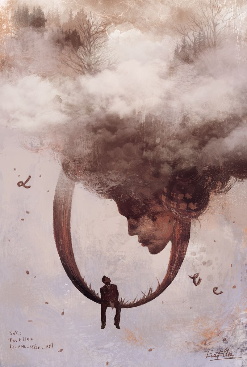
Eva Eller took 3rd place with her beautiful and dreamy piece.
“Eva's piece this month is SO COOL and very unexpected. I love the editorial take on the subject and we can read so many stories into what’s taking place here. Nice use of silhouette and scale. This is how it's done folks!”
Lee also picked 8 more illustrations as honorable mentions, check 'em out with his comments and suggestions below! You can see ALL the entries in the handy dandy slideshow, compiled by the excellent Chip Valecek 😎
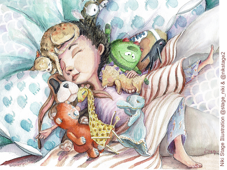
Niki Stage
“Really sweet image that is expertly done. If I had to offer some advice here, I might like to see this palette and value keyed to a blue to simulate a night scene.”
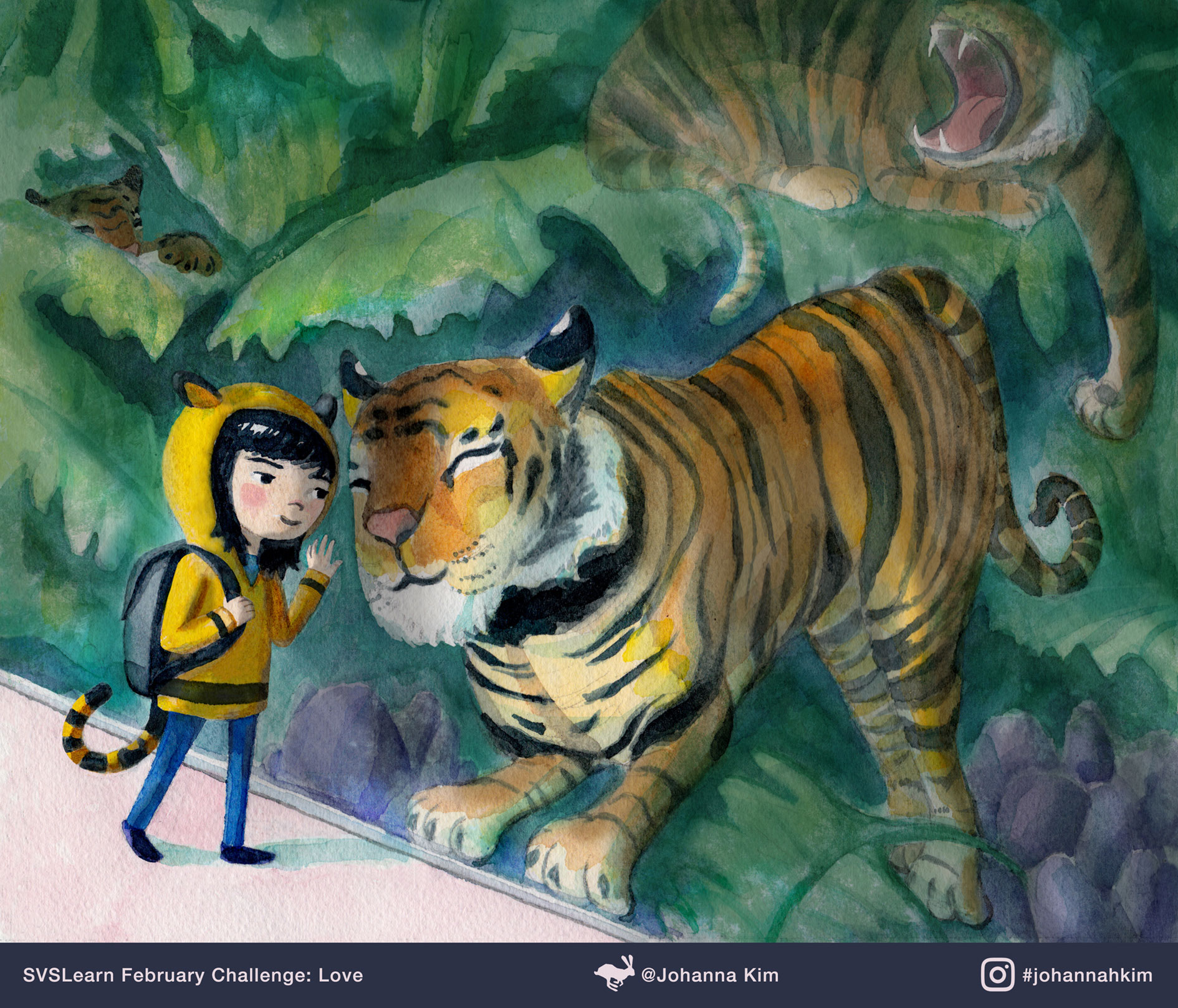
Johanna Kim
“Johanna has been a contender in almost every contest and this one is no exception. Really great. Especially if this is traditional watercolor (it looks like it is). The only crit I'd have here is the glass between the characters isn't reading at all and sort of needs to be read a little quicker. There is a number of ways to pull this off (try in Photoshop first to make sure it looks good, then add to final piece).”
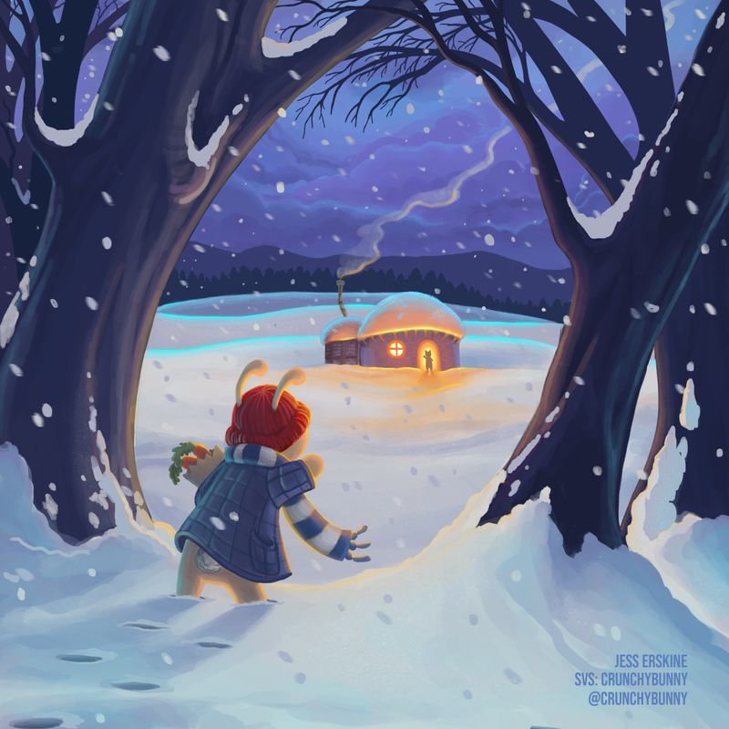
Jess Erskine
“Nice looking night scene here by Jess. This light and color are gorgeous. Everything seems to be working really well here so it's hard to think of anything I'd add. The way to make this scene have more interest could be to play with what is happening with the characters. Right now they are saying hi, which is sweet, but we probably need to add some kind of tension there to add interest. This could be making the main character seem like he is struggling to get home. Or he is cold, etc. But that is getting nit picky. This is a great image.”
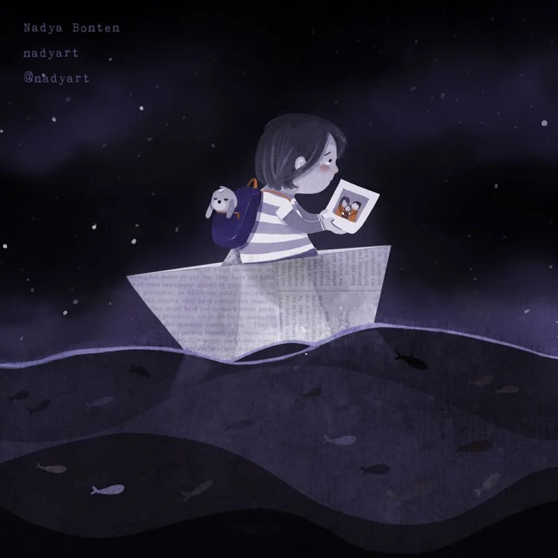
Nadya Bonten
“Pretty and sad image by Nadya and I really love all the stylizations going on here. Nice take on the topic too. Only thing I would suggest is possibly some different composition studies. Right now our main character is too centered and I think it could be very interesting to move it off center. Note: square formats are VERY tricky because it wants to make you put things in the center...”
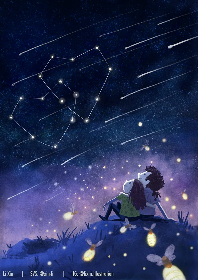
Li Xin
“This is really a sweet piece that adds a nice twist to the Love theme. I love the color balance and characters here. My suggestions would be to think about detail hierarchy. What that basically means is figuring out what the image is about and emphasize that and dial the other detail back. Right now we have the star constellation (which is the real focal point), and then we have the shooting stars which distract from our focal point. And then there are the lightning bugs too. So basically if we calm that other stuff down, the intent of the image will come out a bit more.”
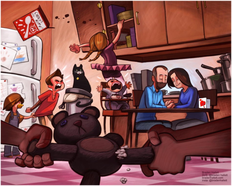
Braden Hallett
“This is a fantastic concept and pulled off quite nicely. The mark making and design are pro level for sure. My only suggestion is similar to what I said in the previous piece. We need to control where the eye goes a little more and that can be done with value and contrast control (Will Terry is a pro at this). If you squint, you will see that the fridge is one of the first thins we look at due to it's light value. I think if the rest of the scene was toned down some with a soft glaze over everything except our focal point, it might resonate a little more. Still, you did an amazing job Braden.”
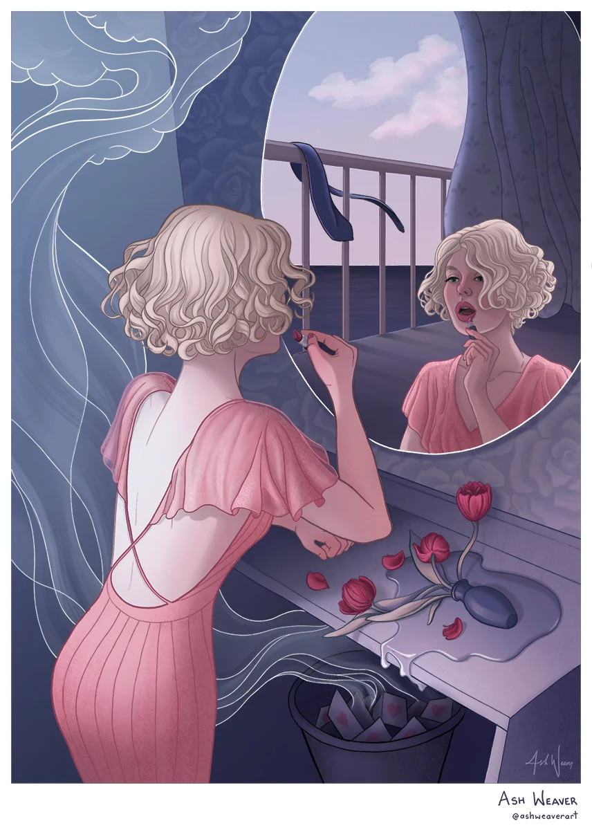
Ash Weaver
“Really cool retro styled image here. I really love the design of this piece and the attention to detail. The storytelling is great and builds nicely as you roam around the image. It's hard to offer suggestions here because it's so well done, but I might want to see some other sketches to try to get more attitude on the character. Something as simple as tilting her head up can do wonders for giving a character a bit more personality.”
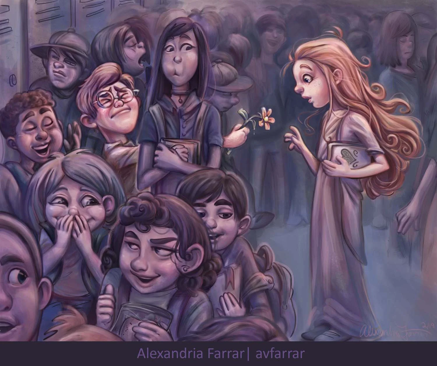
Alexandria Farrar
“This is some stunning character design here. Great control of value and hue as well. The concept is great and I really love it. The only snag for me here was the tall character in between our two love birds. She looks out of place in the image and her expression isn't as well crafted as everyone else. I think just lowering her down in the composition and working on her mouth area would solve the problems there. Amazing job though. That's a lot of characters! : )”
Lee also wanted to say a few words about Rich Cartwright, who was a member of our community.
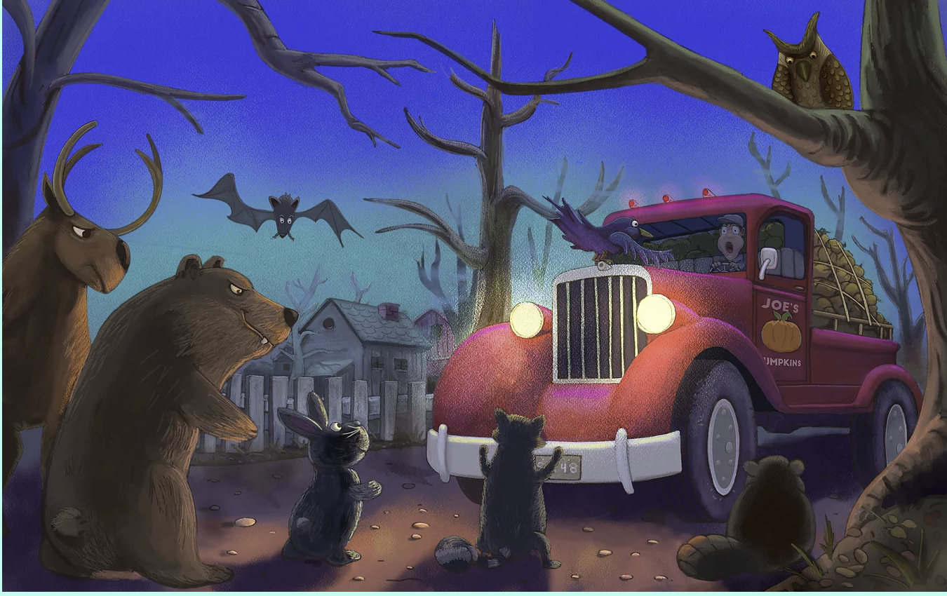
“Before we go, I wanted to offer a moment of silence for a loss we had in our SVS family. Rich Cartwright passed away last month and it hit us all really hard. Rich was a constant presence on the forum and a great guy. He will be missed. I really loved this image Rich did for one of our contests:”
Art by Rich Cartwright.
“Okay everyone, that's gonna do it for now. Keep up all your hard work. It's paying off and the work keeps getting better and better. If you are struggling, just try to get a little better each day and it's amazing what you can accomplish. I can't wait to see your book covers next month!”
Well done everyone! Thanks again to everyone who played, you guys are the best! Bye until next time 👋😄


