Wow! You guys really created some monsters!
From gentle giants to friendly fiends, you totally nailed the whole MISUNDERSTOOD MONSTER thing this month. Thanks to everyone who took part!
Since October is that special time of year when inky drawings fill up our feeds, we thought it would be fun to have Jake Parker (you know, the Inktober guy 😉) as our special guest judge. Here’s what he had to say about the October contest:
“You guys did some incredible work for this month's contest. Every single entry had something to love about it. Whether it was the rendering or it had an engaging concept, I really enjoyed them all and had a lot of fun judging this batch.
My apologies for being a bit late getting you the results of the contest. I managed the Inktober challenge all through October and have spent the last 3 weeks recovering and picking up the pieces of all the projects I had to pause while doing Inktober.
That said, let's get down to it and announce this month's winners.
Here's my judging criteria:
Concept - Is the idea creative, engaging, or unexpected in an intriguing way?
Design - How has the artist used proportion, repetition, balance, color, lighting, and contrast to create something unique, compelling, or beautiful?
Structure - Are the shapes and forms solidly built? Is the perspective right for the piece?
Rendering - Whether it's in color, black & white, or just line-work, what is the quality of the craftsmanship in the execution of the artists vision?”
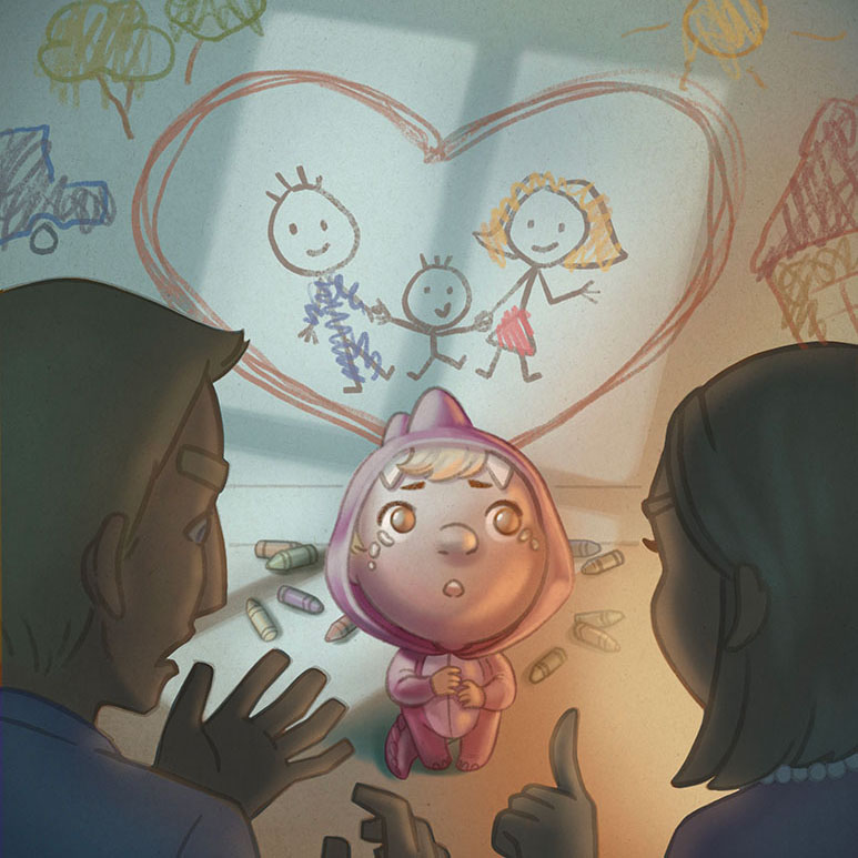
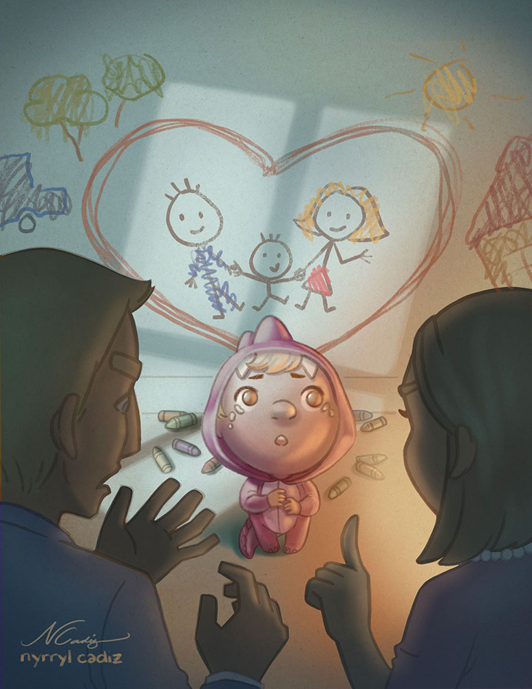
With that, congrats to Nyrryl Cadiz, who took first place with her heartwarming little monster who got in trouble for drawing on the walls. It just tugs at our heart strings!
Per Jake: “This one hit ALL my criteria. I love the concept that the monster is a child in a monster costume who is showing her love for her family...by writing on the walls. I love the design of the character, the POV, and the lighting. Everything looks solid, angles look right and in perspective with everything else. And lastly the rendering is beautiful. Good work!”
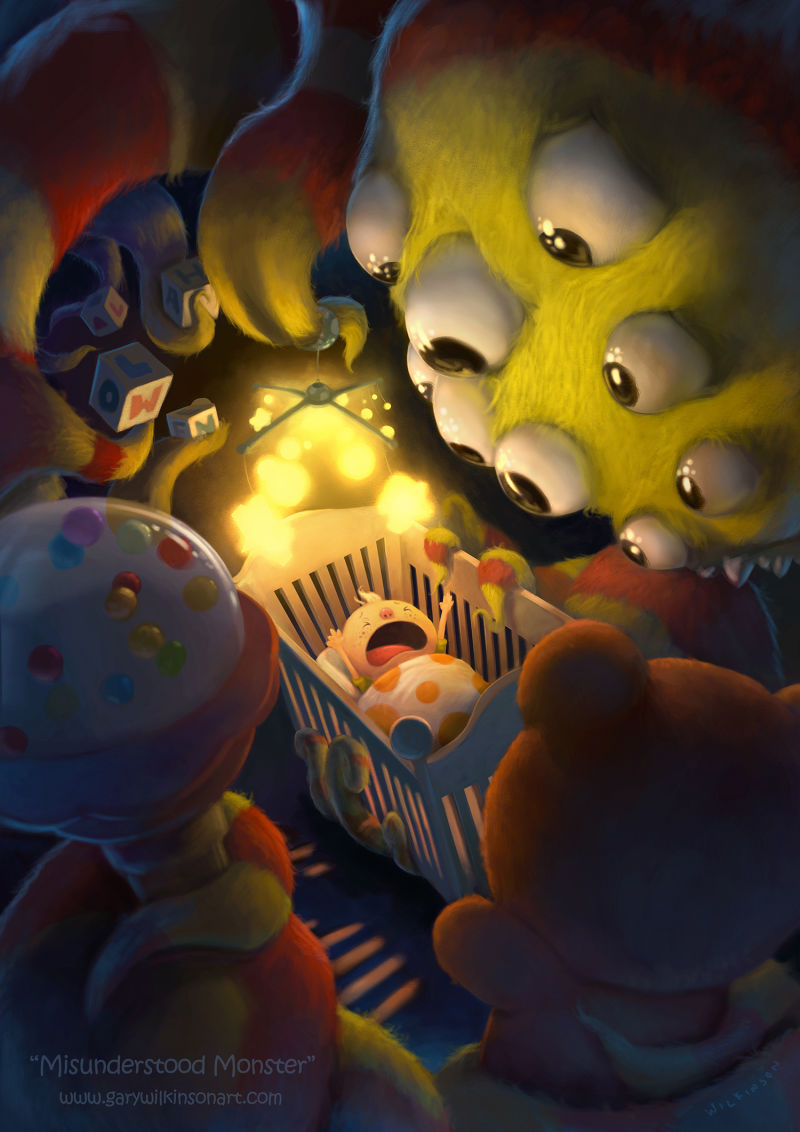
2nd place went to Gary Wilkinson, who is a regular in the top 3 around here!
Here’s Jake again: “I don't know how you made a 9-eye’d monster look worried, but you nailed it. Love the concept here and the lighting and rendering are solid. The composition is a bit too crowded for me, but it still works for the piece. Nice job!”
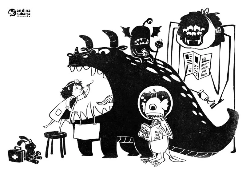
3rd place went to Andina Subarja, with her fun take on a visit to the dentist’s office.
“This one is just gorgeous to look at. I'm really digging the texture and flat designed look this piece has. And the character designs are super charming. One problem is the spider's outside legs read as a doorway at first.”
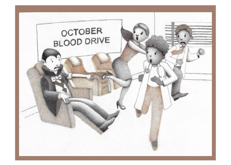
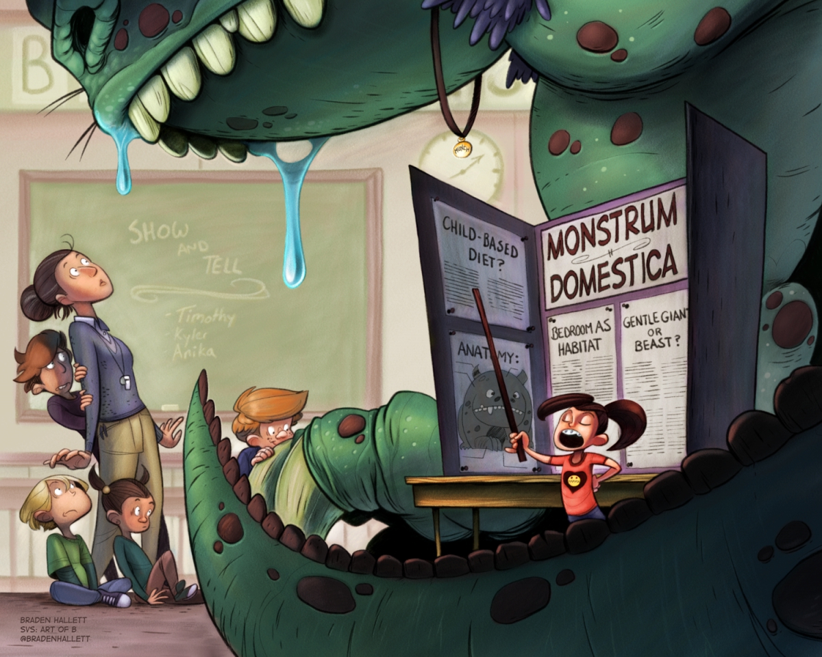
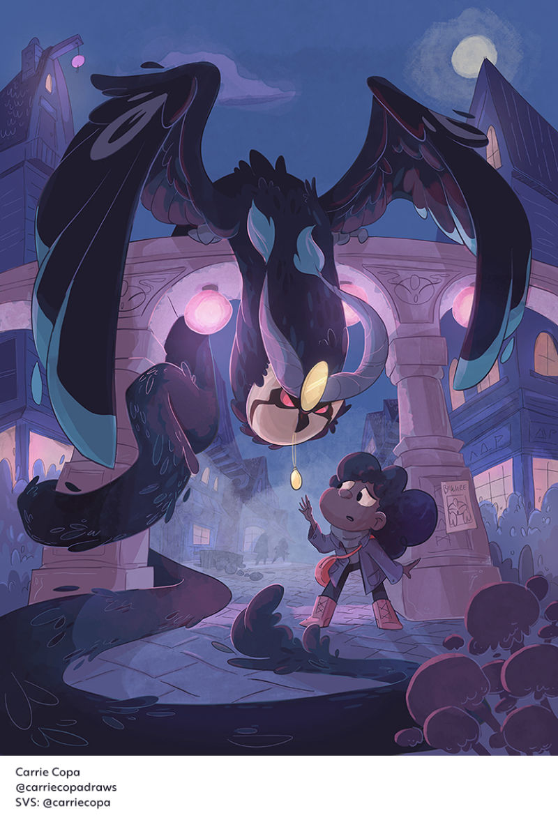
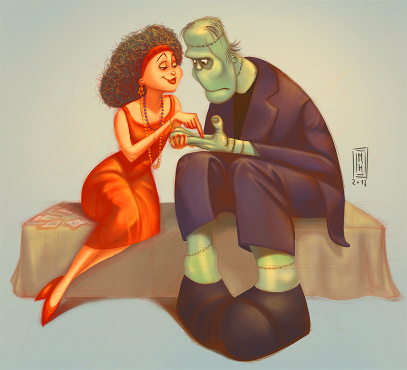
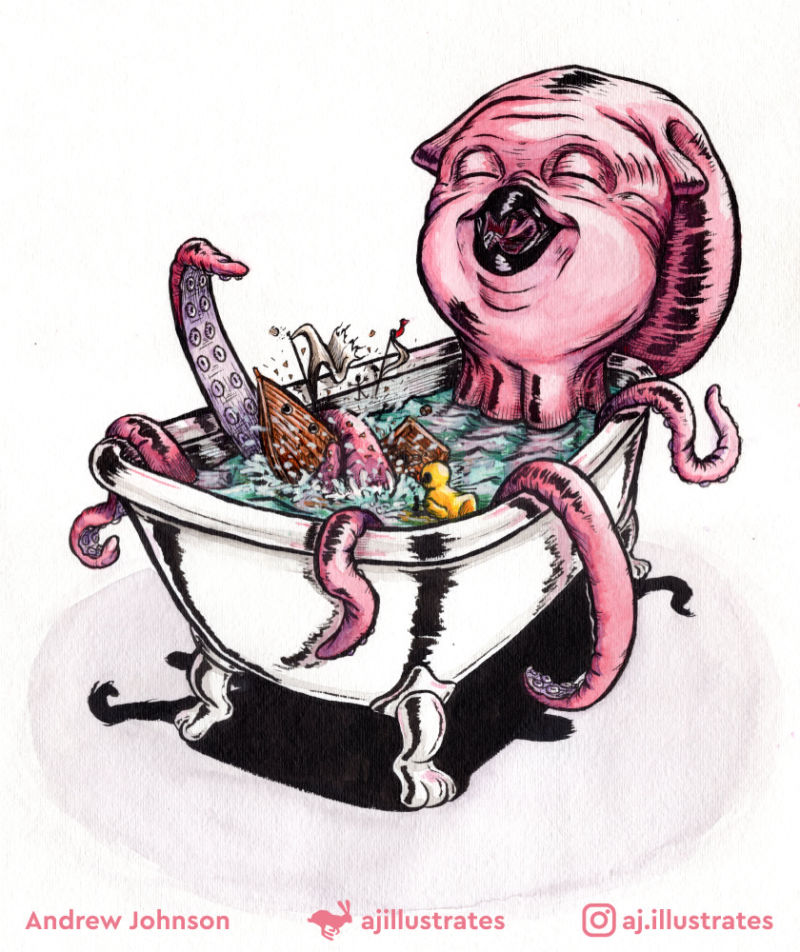
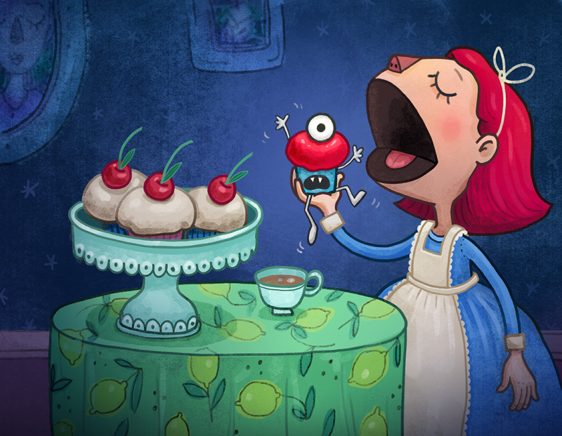
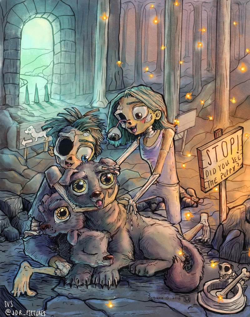
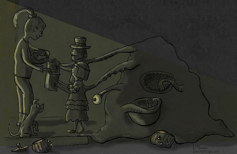
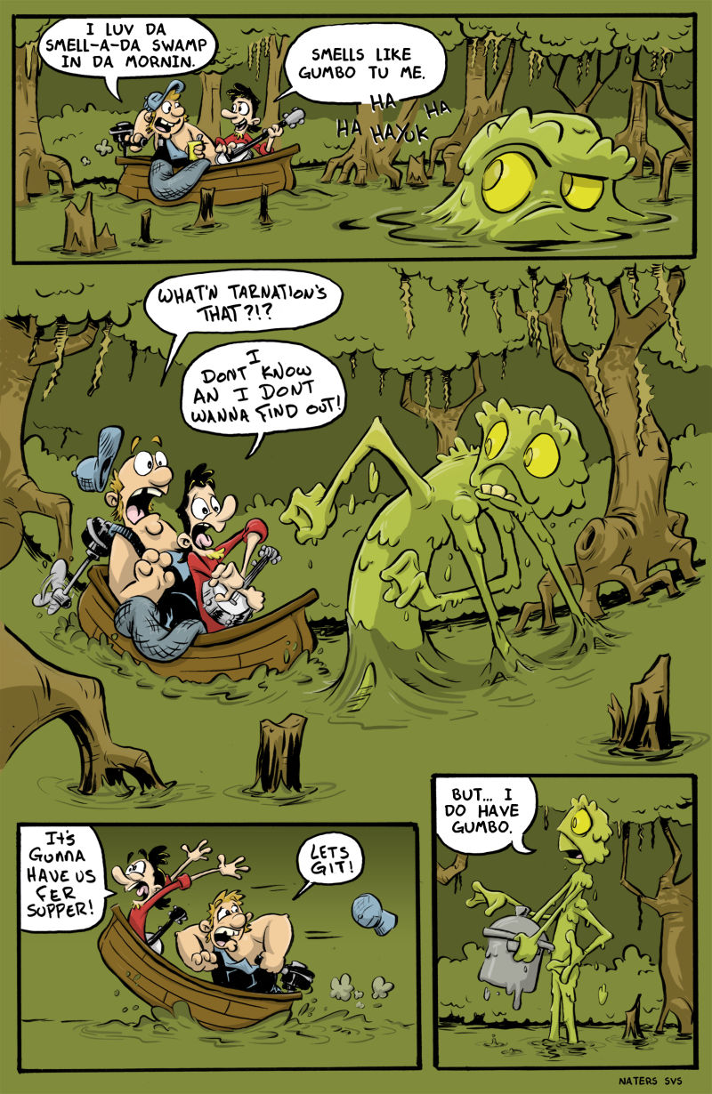
Jake also ended up picking 10 more illustrations as honorable mentions 😀🏆💕 Check 'em out (with his comments) below!
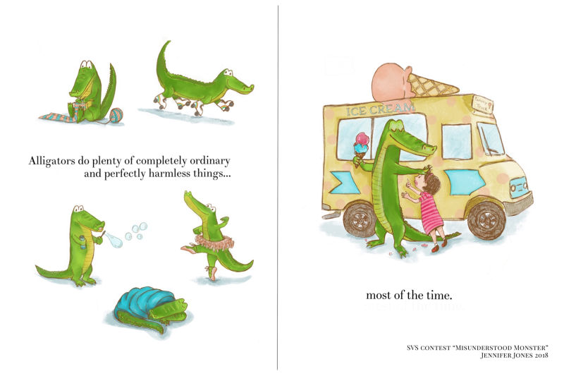
Jenny Jones
“Picture book please!”
You can see ALL the images in the handy dandy slideshow. Thanks again everyone for playing! Way to go, team!

