This was a tough one! The prompt for the March art contest was OLD AND NEW, and we got so many interesting interpretations of that. Thanks to all who took part!
Per Lee White, who judged the contest: "I think this was probably the hardest prompt we have had and I really liked what you guys did with it. That said, we had fewer entries because I think it was a little too hard for some beginners to tackle. So if you have an entry this month, I want to commend you for going for it!"
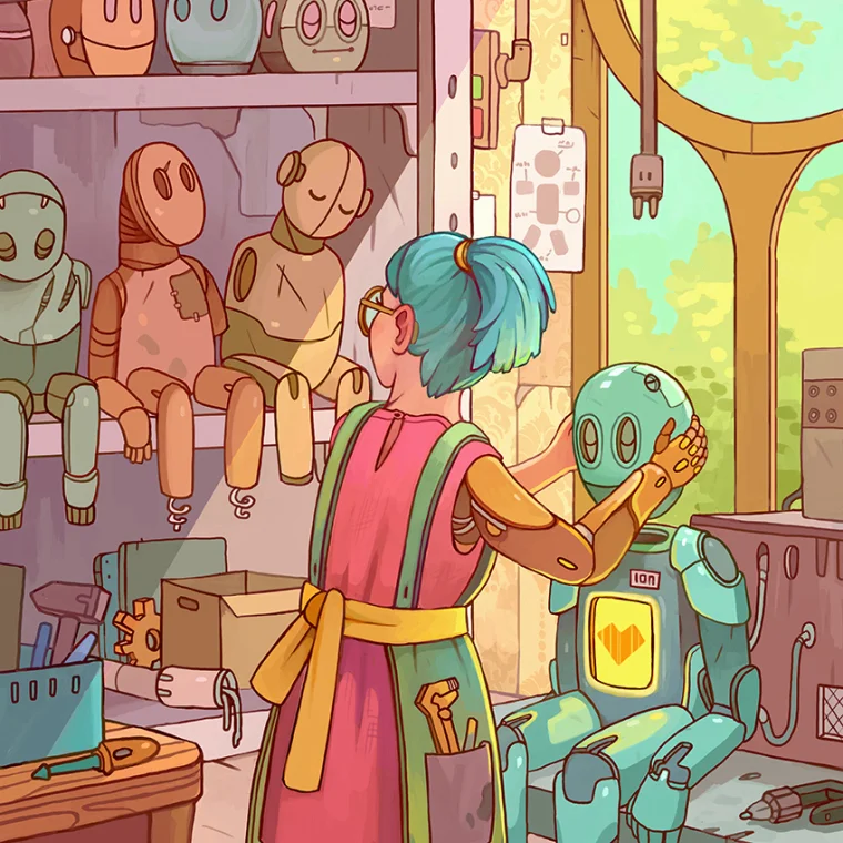
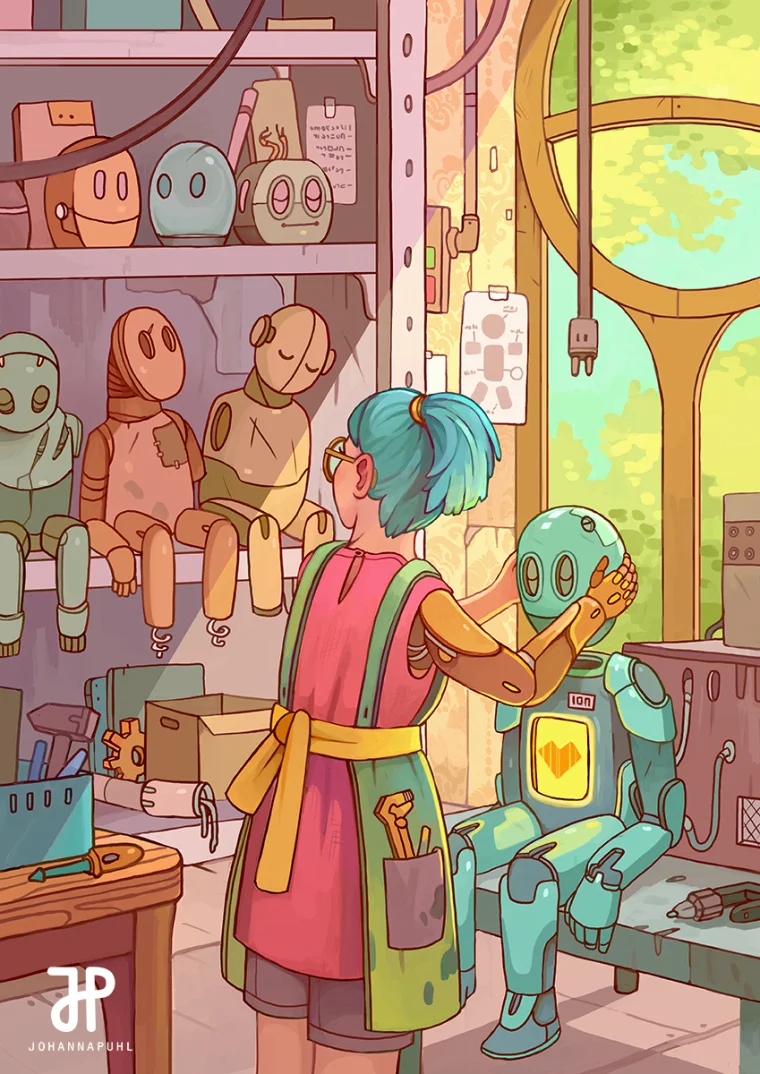
Congrats to Johanna Puhl, who took first place with her technicolor robot workshop! Per Lee, "I knew this was going to be a tough one to beat right when I saw it posted. The concept is clear and the overall technique and color balance is flawless. Everything is working in harmony here and I just love it."
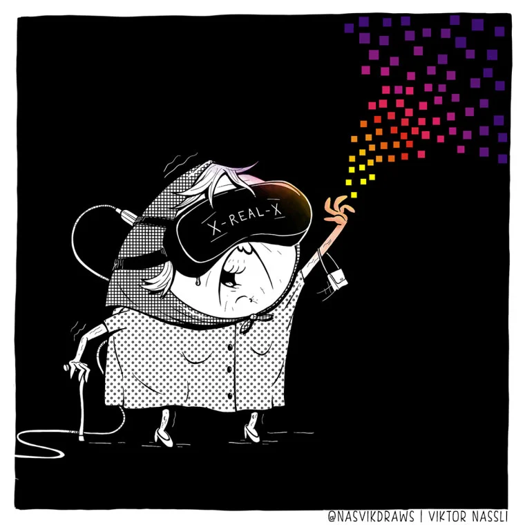
Second place went to Viktor Nassli, for his fun take on old meets new. Here's Lee again: "A lot of people used an older person vs. new in the illustration as a way to tackle the prompt. Viktor's stood out to me because of the fantastic styling and color choices. It's an instant read that would work great as an editorial illustration."
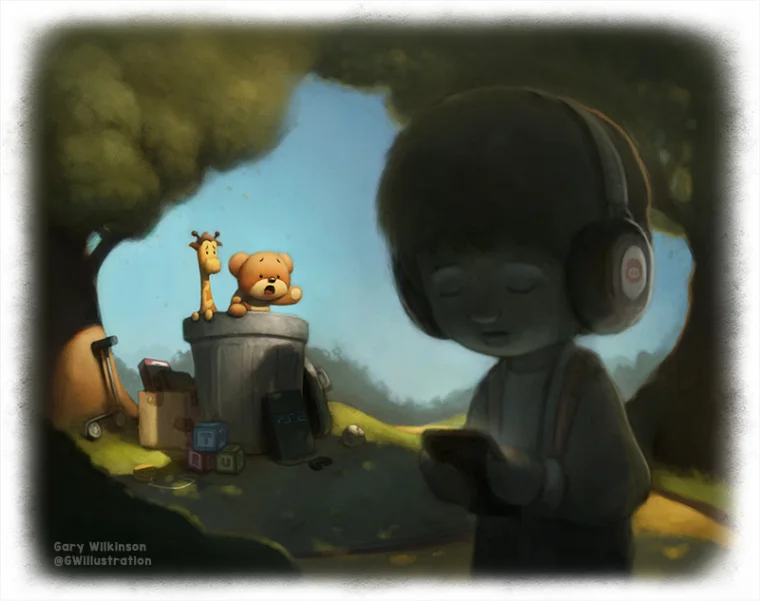
3rd Place went to Gary Wilkinson, who really captured the dark side of technology. "Gary nailed this one with the bright toys in the background and the kid wandering off into the dark. It's interesting that a lot of people gave a negative take on technology vs. older analog things like books and toys. I saw this one evolving on the forums and really appreciate the work and care that went into it."
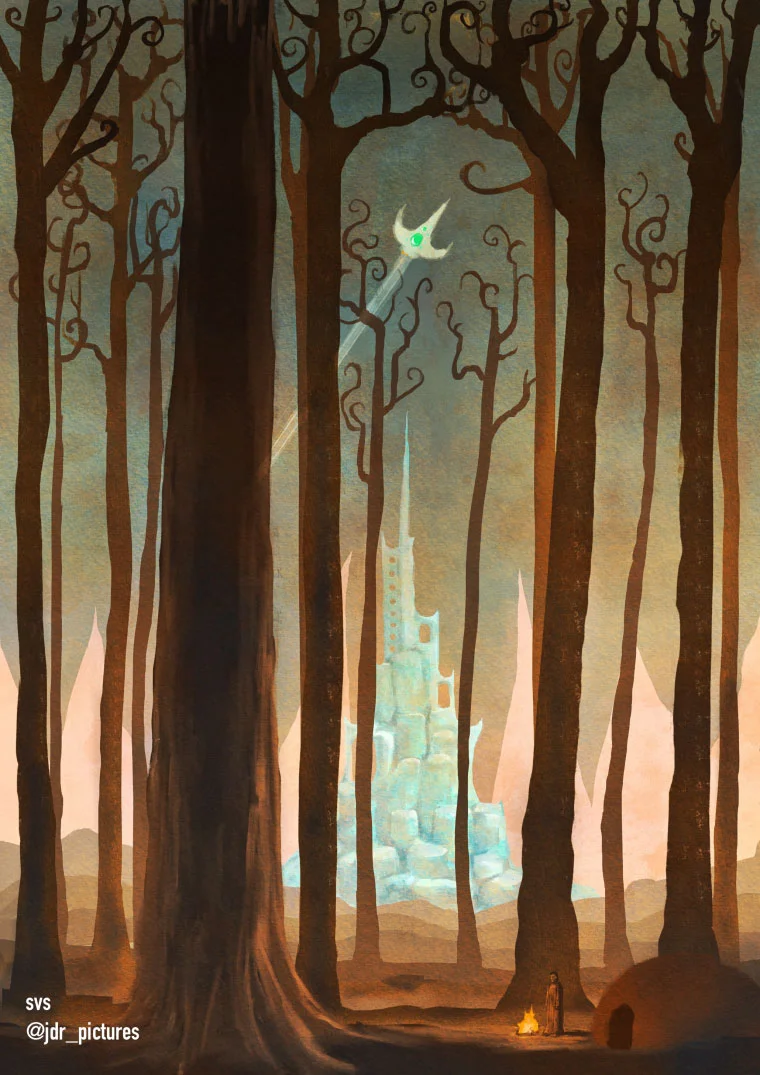
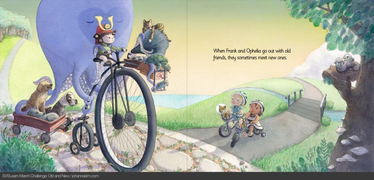
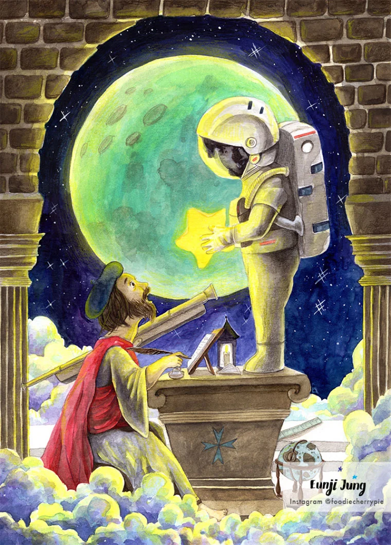
Lee also ended up picking 4 images as honorable mentions, check them out with comments below!
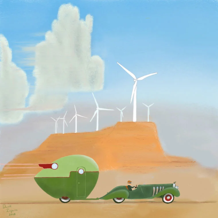
David Ingalls
"Really cool retro image with the turbines in the background. Very clean styling and design make this such an attractive image."
You can see ALL the images in the slideshow. Thanks again to everyone who played this time, extra bonus points for stepping up to the challenge! Until next time 😊

