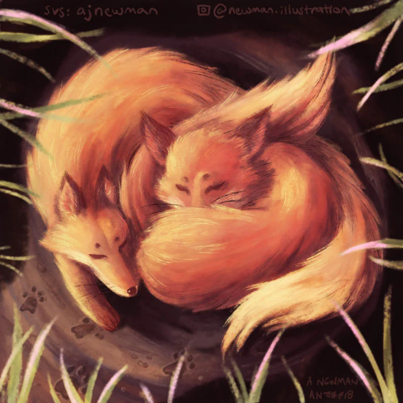
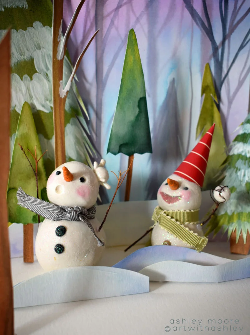
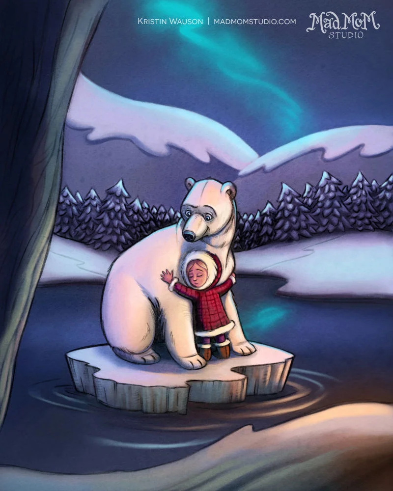
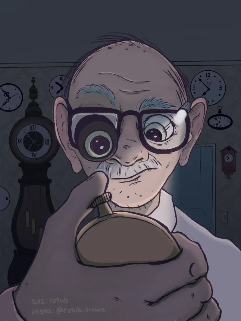
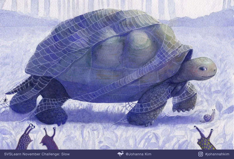
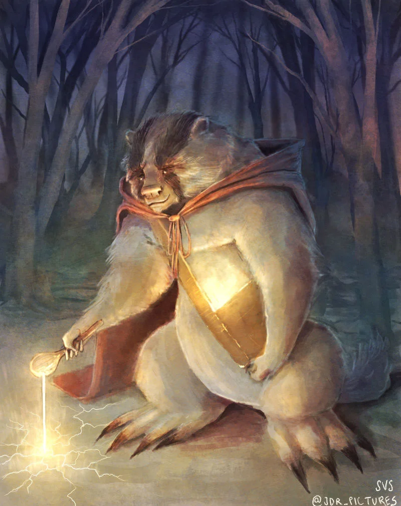
Well, we got off to a slow start in November, but you guys really pulled through with some beautiful work! It was nice to slow down and enjoy the quiet little moments you all created 😊🐢☕️
This month we returned to our regularly scheduled format, with Lee White as the judge. Here’s what he had to say about the SLOW art contest:
“Slow was an interesting topic and I wanted to see how you guys handled it. I got a LOT of turtles and snails which I like because they are such interesting little creatures. I also got some great scenes where things are just chillin' and time is going by. All in all, some really cool stuff!”
Without further ado, here are the top picks!
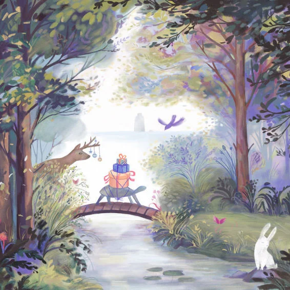
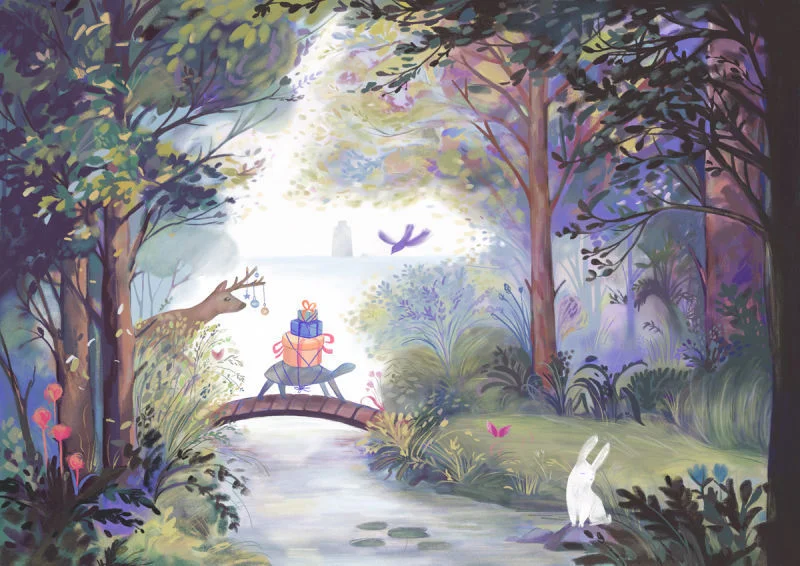
First place went to Nelli Ahosola, who brought a quiet magic to this woodland scene.
“This image was my favorite of the turtle/snail images because of the creative flourishes. The presents on the back of the turtle and the ornaments on the deer are so nice and the palette is soft and inviting. Very well done image in a modern style. Great work!”
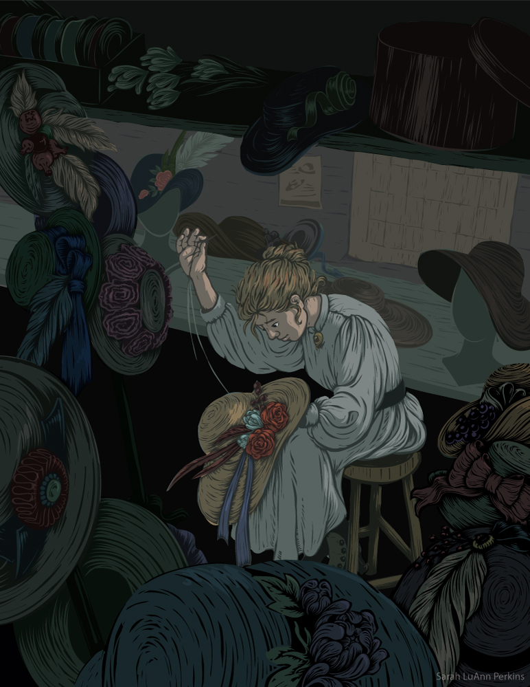
Sarah LuAnn Perkins swept second place with her lovely milliner toiling over her enchanting hats.
“Sarah nailed this illustration with a cool woodcut style. I really loved this interpretation of the theme because it reminds of the old classic folktales where someone is forced to do something like make hats all day. Typically by a mean troll or gremlin or something. I sat with this one a while and asked myself why does it remind me of that versus looking like a serene scene where a young lady is making hats and wants to be there. So I looked at the darker tones, the muted palette, the way she is hunched over like this task is heavy on her shoulders and that is why it seems like a curse instead of a joyful practice. Am I right? I have no idea! But these are the things that lead your viewer to make a judgement on what is happening in a scene. So you need to think carefully about the choices you make.”
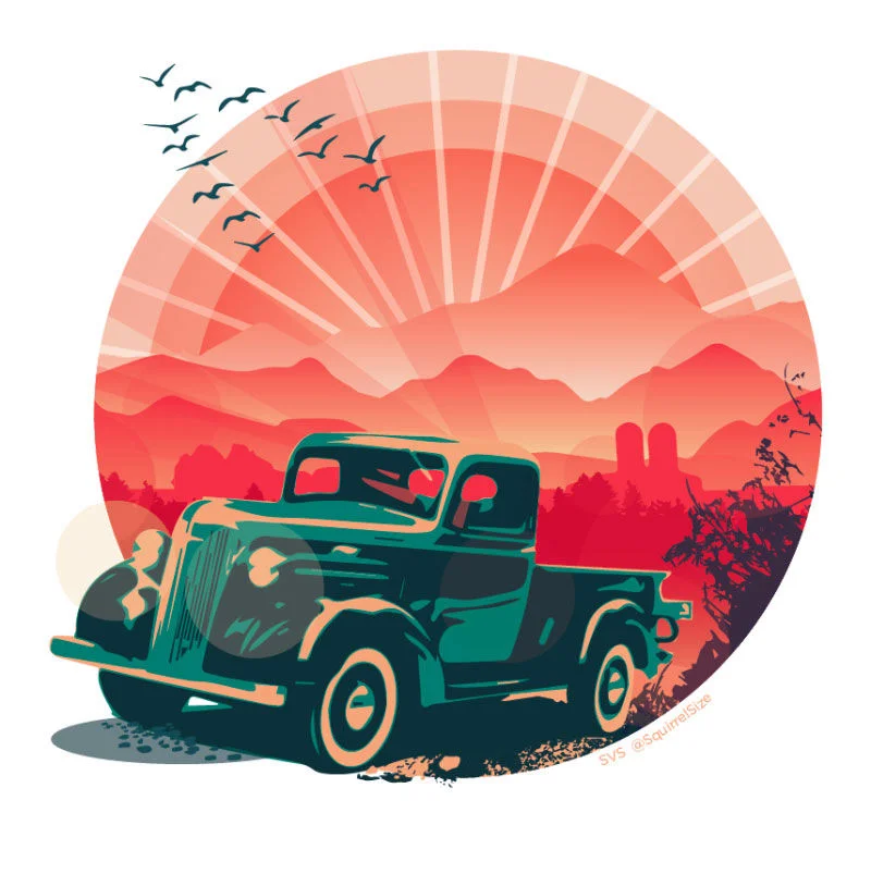
3rd place went to Elizabeth Holmes for her old-timey take on a classic old truck.
“I really dig this color palette and the graphic treatment of the subject matter. Not a ton of story going on there, but those trucks are so classic and I liked the homage to the old advertisements that used this particular style. I could see this image on the side of a crate of oranges or something from the 50's. Really cool!”
Lee also picked 6 more illustrations as honorable mentions, check 'em out with his comments below! And to see ALL the entries, peep the slideshow 👀
Well, that’s a wrap! Great work everyone! Thank you all for taking the time to make something beautiful 👏😄
Here’s some closing comments from Lee:
“OK guys, that is going to do it for this year. I really appreciate all your hard work entering these contests and hope it has paid off for you in building your portfolio. Even if you didn't win or make the top of the list, using the prompts is a way to get good and work on something with a focused theme. Do not judge yourself too much here because I am not the be-all-end-all critic. If someone else judged these contests it would be a totally different set of winners. The point is to make work we are proud of and challenge ourselves each month. So keep it up!!!
One of my favorite things about this contest is how you guys root for each other and try to help each piece get better. Even when those illustrations you are helping in the forum will be pitted against an image you are entering! That is more telling than anything to me. That we are all in this together and we have to keep encouraging each other despite our individual wins and losses. I'm very proud of the community we have built here and you guys are a shining example of how a community is supposed to be. We make each member stronger than they could ever be on their own.
I wish you all a happy holiday and will see you again with a new contest in January! : )
Cheers,
Lee”

