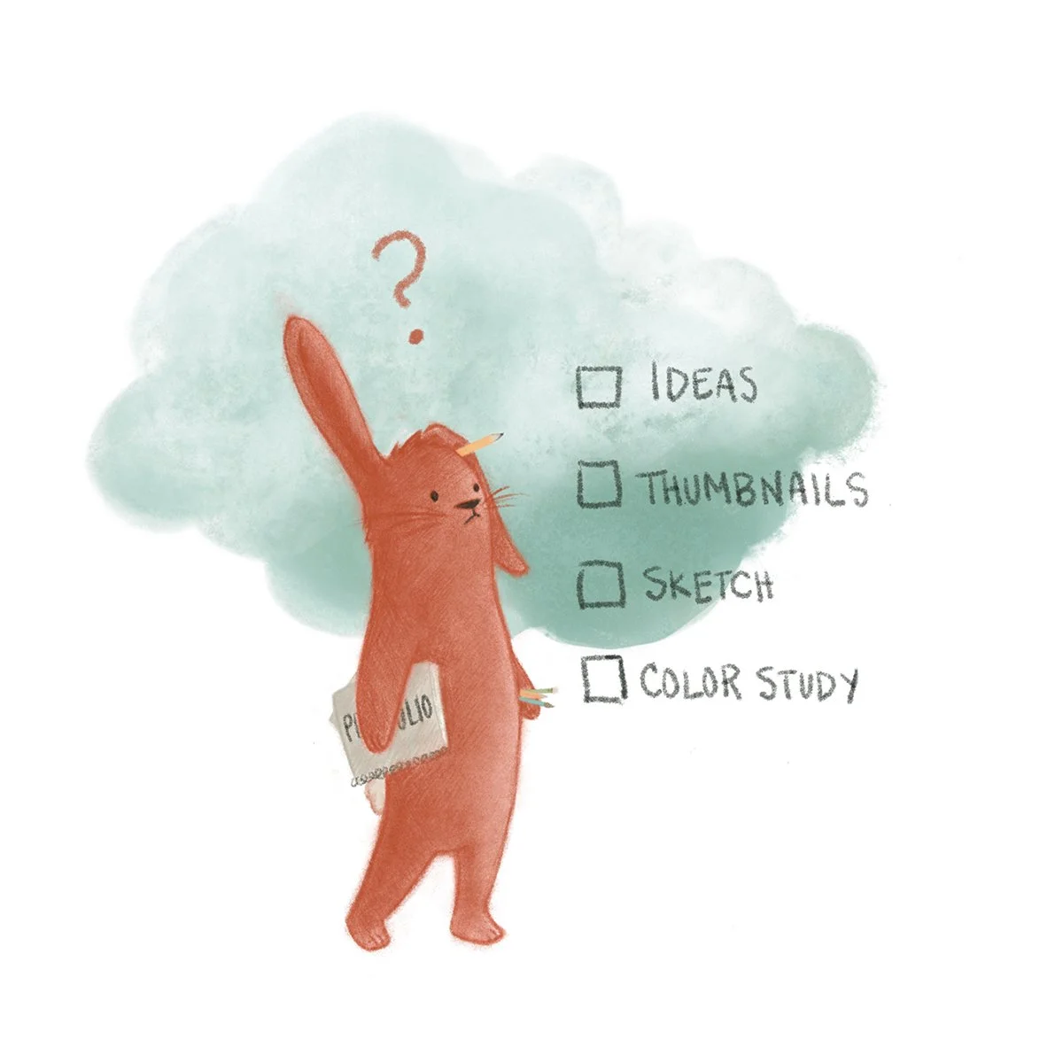
Art by Pamela Fraley
Is my style too mature for kid’s books? Is design more important than drawing? What’s the big deal about shapes? Jake Parker, Will Terry, and Lee White address these topics and much more in this episode.
Note: We’ve done our best to provide relevant links to products mentioned in this podcast. SVSLearn and the 3 Point Perspective podcast are supported by qualifying purchases. Thank you for your patronage!
SHOW LINKS
How Much Money Do Children’s Book Illustrators Make: 2021 Survey ResultsCritique ArenaBuilding a Strong Portfolio
KEY TAKEAWAYS
No matter how good your drawing skills are, it’s design that will make or break any image.
Shapes are a language; learn to speak (or draw) it!
If you want to make great art, take the time to evaluate everything you create. Discover what’s working and what needs improvement and make deliberate changes based on what you learn. This is how progress happens!
QUESTIONS
Raphael says, “I remember one episode where Lee shared an awesome checklist every artist should go through to end up with a killer image. Unfortunately, I couldn't take note when I heard it and now I can neither remember every item on the list nor find the episode in which he says that. Looking forward to hearing this one again, along with Will's and Jake's checklists, and this time I'll be ready to write it down!”
Jake, Will, and Lee have very similar lists. Together, they look something like this:
Concept: What am I trying to say, and does the message read clearly?
Gesture: Are my characters in expressive, storytelling poses?
Design: Do the clothing, architecture, and details in this image follow the principles of design (balance, alignment, unity, emphasis, contrast, proportion, etc.)?
Structure: Are the volumes, shapes, and perspective consistent and accurate?
Rendering: Is my line control solid and my technique deliberate?
Nir (@sketchart_stern) asks, “I’m working on my basics (hoping to be a children's book illustrator). Learning the fundamentals, shapes are everywhere. But often when I look at professional illustrations, especially in children's books, I cannot see any. I can detect forms and some way of creating depth (like overlapping lines, shadows, etc.), but not much else. What am I missing? Is my focus on three-dimensional shapes and perspective wasted and I should focus more on other elements such as color theory?”
Shapes form a language; each one carries inherent emotional connotations. Triangles represent danger, squares represent steadiness, and circles imply softness. When you’re looking for shapes in illustration, think less about the literal forms and more about how all those forms converge to imply character traits. For example, a small child may be drawn with many circles and soft lines to show cuteness, while a superhero will be more angular and blocky to imply strength. When you learn to interpret shapes symbolically, you’ll be able to utilize them in your work to describe your characters and environments.
While drawing and shapes are important, it’s design that will make or break your illustrations. Focus on great design in addition to your drawing skills; it’s a winning combination!
Chris (@ivwands) asks, “I have been building a body of wall/fine art. I’ve always considered the work illustrative, and narrative is a focus in my creative process. Your podcast has opened the doors to book illustration as an avenue, but I am unclear what niche my work and style might inhabit. Kids' books seem almost inappropriate and comics seem daunting with my style. I remember Stephen King’s ‘The Stand’ having chapter art similar to what I do, but is that rare in adult fiction? Any illumination would be appreciated.”
While not suited to children’s literature, your work is perfect for book covers, chapter heads, or spot illustrations. Your style is very decorative, so if you’re interested in any kind of narrative work you’ll need to learn the art of visual storytelling, including gesture and character design.
A little tough love: you’re great at drawing and design, but your portfolio is all over the place. If you want to get the attention of art directors, you’ll need a portfolio that is concise (roughly 20 images), cohesive, and only your best work. Make new portfolio work that represents your current skill level; you have it in you! Bonus: if you’re interested in the publishing world, illustrate your favorite books or stories; it’s great practice and shows art directors what you’re made of.
You’re in for a lot of work, but you have the skill and your effort will be well worth it!
LINKS
Jake Parker: mrjakeparker.com. Instagram: @jakeparker, Youtube: JakeParker44
Will Terry: willterry.com. Instagram: @willterryart, Youtube: WillTerryArt
Lee White: leewhiteillustration.com. Instagram: @leewhiteillo
Daniel Tu: danieltu.co.
Lily Howell: lilycamille.com
If you like this episode, please share it, subscribe, and let us know your thoughts or if you learned something new!
If you want to be a part of the discussion and have your voice heard, join us at forum.svslearn.com.

