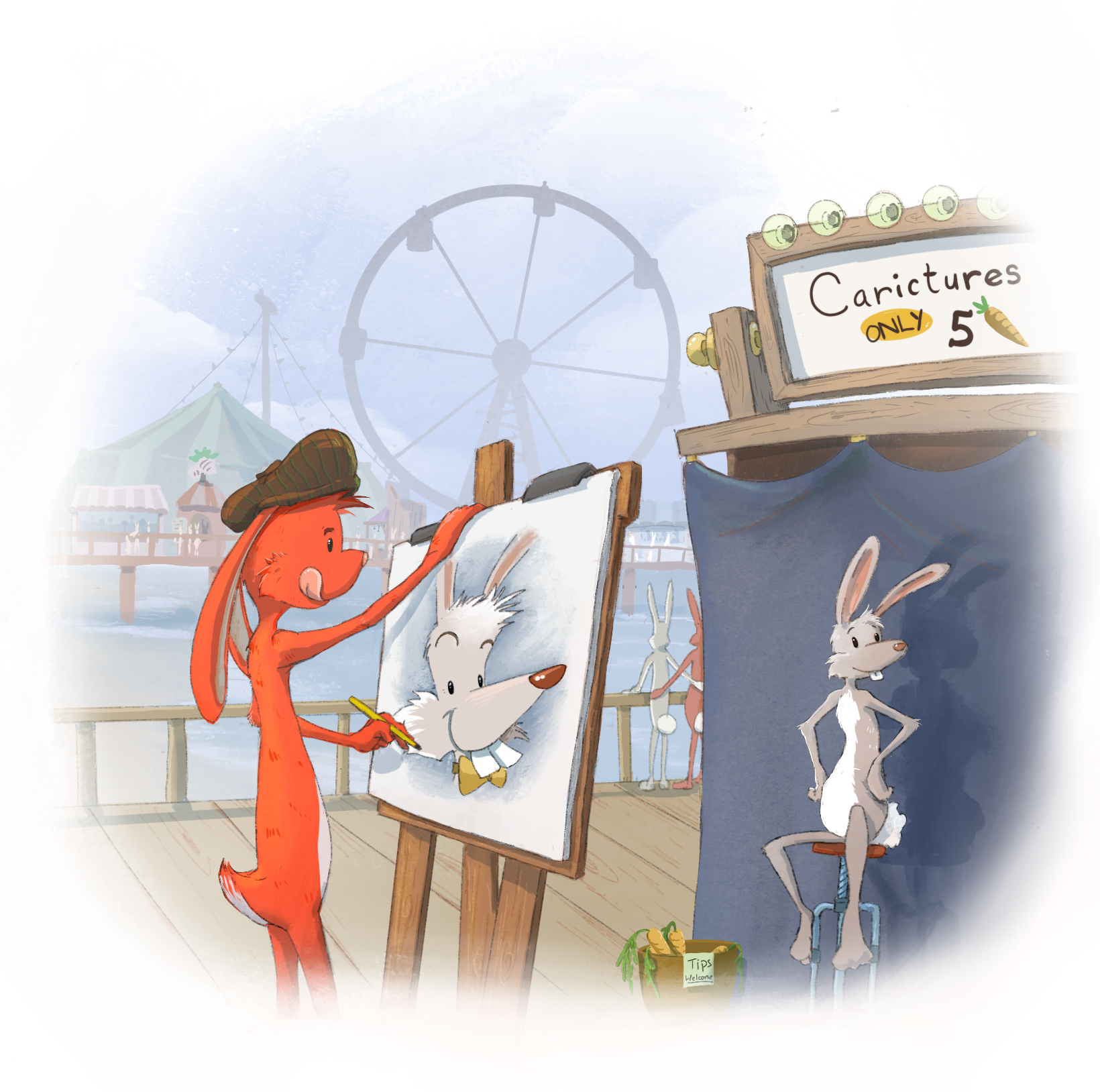
Art by Josh White
Should I return to traditional art? How do I make my digital work look natural? Are caricatures really art? Jake Parker, Lee White, and Will Terry discuss all this and more in this episode.
Note: We’ve done our best to provide relevant links to products mentioned in this podcast. SVSLearn and the 3 Point Perspective podcast are supported by qualifying purchases. Thank you for your patronage!
SHOW LINKS
Draftsmen Podcast
Mort Drucker
The Mad Art of Caricature by Tom Richmond
Art of Caricature course by Court Jones
The Art of Caricature course by Jason Seiler
Sebastian Krüger
Al Hirschfeld
Steve Brodner
Drawing the Head and Hands by Andrew Loomis
Mark Ryden
Hi-Fructose submission page
Juxtapoz submission tips
KEY TAKEAWAYS
To be a great caricaturist, you must master foundational portrait drawing skills.
When selling prints, consider what kinds of images your audience would want to hang on their walls; art that’s perfect in one context doesn’t always carry over to home decor.
To make digital work look more natural, study traditional media. Learn its idiosyncrasies, and then experiment with how you can recreate those traits digitally.
Always read and follow guidelines carefully when submitting your art to magazines or other publications.
QUESTIONS
Mick asks, “What do you think of caricatures? Are they considered real art? Are they considered illustration? Is there money or a future in caricatures?”
When done well, caricatures take artistry and skill. There’s a range of what is considered caricature art, from the quick marker drawings you can buy at the amusement park to highly rendered comical portraits. Each style has its place; speedy sketches can make someone’s day and entertain onlookers, while polished cartoons can accompany editorials, win awards, and make statements about politics and culture. The best caricature artists are masters of foundational portrait drawing skills, so spend time practicing those if you want to draw convincing caricatures. (Study Andrew Loomis’s planes of the head and Frank Reilly’s rhythms of the head!) Stay tuned for episode 119; we’ll hear from professional caricaturist Tom Richmond who’s sure to have insight into the future of this niche!
Ana (@luna.ana.art) asks, “My background is in traditional painting, but I mostly work digitally now. My most fulfilling work has been designing album covers for bands. At one point my illustrations seemed popular on Instagram and I have a decent following but now the hype has died down. I haven’t changed much style-wise, so I don’t know what’s going on. My questions are: Is there a niche for paint-like illustrations? How can I illustrate for the bands I like? Do galleries accept prints to sell? Should I just go back to traditional? I love what I do but it’s hard not to get discouraged when I see that I don’t belong in typical illustration or traditional art.”
Ana’s style is fantastic; it’s specific and gallery quality. It’s perfectly suited to Juxtapoz or Hi-Fructose magazines, and she should submit it to them! (Make sure to read and follow all of their submission instructions to a T. Here are some helpful guidelines.)
A few more thoughts:
You’re getting less traction on IG because everyone is; the algorithm is not boosting posts like it used to. Focus on reels for better reach and engagement! But more than that, make great art and worry less about your likes and follower count; the right people will find you if you keep doing what you’re doing.
Some galleries take prints, some don’t; search until you find one that does.
If you want to sell more prints, consider what images you could create in your style that many people would want to hang on a wall (some images that work for album covers won’t fly in home decor).
Album covers aren’t a reliable source of work, so balance your career with traditional gallery work.
Andy asks, “I have been working digitally for years now and recently stepped up to a Cintiq. I am loving it, but I struggle with over-rendering. I am currently auditioning a lot of different brushes and even though I’m doing my best to mimic traditional media, I’m still getting an image that looks too carefully created. I’ve limited the accuracy of some of my brushes and erasers, I’ve given myself a limit on how many variations of color I am allowed to use, and I’ve even tried to stay away from the all-powerful UNDO button. These are all helping, but I feel like the problem is in my approach. Do you have any insight on how to keep from doing work that is so carefully created that it’s obviously digital?”
When working in traditional media, we get “happy accidents” through human error and the nature of the physical elements. For a more natural look when painting digitally, study the medium your want to mimic. Learn its quirks and discover how you can create the same “accidents” deliberately. This should help you achieve a more organic look!
LINKS
Jake Parker: mrjakeparker.com. Instagram: @jakeparker, Youtube: JakeParker44
Will Terry: willterry.com. Instagram: @willterryart, Youtube: WillTerryArt
Lee White: leewhiteillustration.com. Instagram: @leewhiteillo
Daniel Tu: danieltu.co.
Lily Howell: lilycamille.com
If you like this episode, please share it, subscribe, and let us know your thoughts or if you learned something new!
If you want to be a part of the discussion and have your voice heard, join us at forum.svslearn.com.

