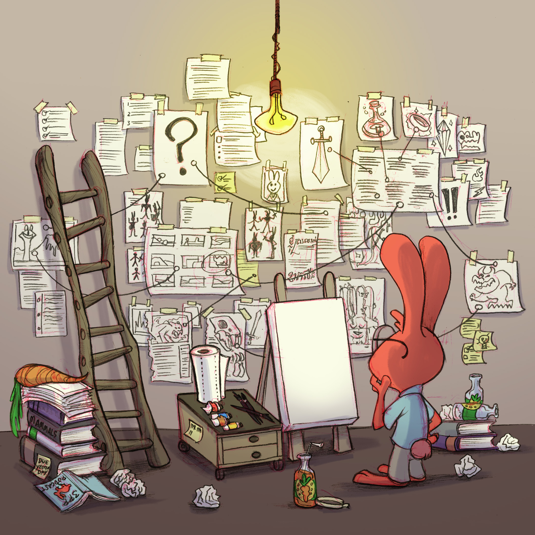
Art by Tanner Garlick
What if you could make money off of artwork you did years ago?
That’s what Gina Lee does. She has a class on SVS where you can learn about how you can take artwork that you have already done or how to create new artwork that can be used for licensing (i.e. paper plates, decorations, etc.) You can check out that class here.
This next week we will be releasing a Part 2, which will cover: Trend forecasting, developing your personal style so it’s more desirable to licensers, and how to create vision boards to help direct your work for what you want to do for licensing.
Jake is reading, Keep Going by Austin Kleon. One section is all about “Create For the Sake of Creating” and Austin talks about how you can sometimes just create something and then toss it, shred it or burn it. Create just for the sake of creating. It makes the creation all focused on the joy that comes from creating, not the end product. Sometimes we get so focused on the end product, whether or not we can scan it, share it, etc, that we lose sight of the joy of creation. Oftentimes kids only care about the experience of creating, they aren’t so focused on making something perfect. Sometimes it’s nice to not be so focused on the end product.
Our topic today is: How to Convey a Message or Story With Your Art
The Kick in the Creatives podcast covered this topic and they are tagging other podcasts to cover the same topic; we were tagged by them to go over this topic and they are wanting us to tag another podcast to then talk about this. Out tag is: One Fantastic Week.
Storytelling
As illustrators here, we are going to focus on how to convey a story with your art.
Jake overheard this experience, when Will was teaching a class with Brian Ahjar about creating great backgrounds. Brian is really good at telling good stories with his art. Will and Brian were critiquing students work in their interactive class and the problem many of the students were having was that they were telling story fragments. Brian’s critique on a lot of the pieces was: “I don’t know what the story is.” Oft times the illustration can confuse the viewer more than it communicates something clearly.
Just because you’re drawing a picture doesn’t mean that you are saying anything. That’s a problem you see a lot of times with amateur illustration work they just draw a character or an environment with no story in mind and oftentimes people don’t know what’s going on or have any deeper questions that they want to know more about after seeing the illustration.
That’s what we want to go over: how to tell a story and why that’s so important as illustrators.
Longevity, if something is going to be interesting for a long period of time, then it needs a story. On the other hand, sometimes people run into the problem where they tell too much story and it doesn’t give the viewer any work to do or allow the viewer to participate at all; there is a good middle ground where people can come back to it again and again, and depending on where they are in life, they can maybe read the image in a different way.
Sometimes people paint a barn that has really no story to it, and unless it’s just amazing if it’s not telling a story then it’s not going to be as interesting.
If you aren’t telling a specific story, often what you draw asks questions rather than answers questions. Sometimes you are asking more questions and making things more confusing than you are answering. I.e. Will saw this student’s illustration where there was this happy woman in the foreground looking over her shoulder and a happy dog trailing behind her, and then in the background there is a girl that is upset, but there are not cues as to why the child is upset. You might imply that this woman is the child’s mom and that she was happy from just disciplining her daughter. It seems that she almost has glee that her kid is upset, which probably wasn’t the illustrator’s intent. That’s an example of asking more questions than you are answering.
You are asking more questions than you are answering, that is starting to move away from illustration and more towards fine art. Which can oftentimes be a lot more abstract and wanting the viewer to ask questions and think more.
David Dibble does these amazing barn paintings, with terrific color, light and shadow, but when doing that these are more of a gallery piece, a decoration for someone with a lot of money to hang on their wall. They are a decoration. The piece’s purpose isn’t so much to communicate a specific story.
Your job as an illustrator is to tell a story.
1. Every image spurs a question in your viewer.
2. Every image should elicit some sort of emotional response from the viewer
It should make them laugh, or make them interested in the story or in the character, make them want to turn the page to see what is going to happen next, make them angry, inspire them, give them awe, etc. Really cool concept art: creates a feeling of really wanting to see the movie and make the viewer want to see those characters in the movie.
Sometimes it is an action that is not resolved until the next page and it makes you want to flip the page to see what happens next.
For illustrators, generally the response you want to evoke should be the same for a broad audience. I.e. a scary illustration for a scary book, you want everyone to feel the same way, there is some intent behind it. While for fine art they desired response may be more open and it may be a lot more open to interpretation.
3. Always include a character or some sort of evidence of a character.
Don’t make your images merely decorative. Will was giving a portfolio review and the very first image was really nice but it wasn’t telling a story. Sometimes as an artist you will make these “pinnacle pieces” that are better than anything else you’ve done. If you are trying to build a portfolio to do children’s book work, you don’t want to lead with a piece that isn’t telling a story. What are you saying to a potential client?
Why the need for a character? Even if it’s a landscape it could be a castle in the distance, or a rusty car in the corner. It is almost like we are programmed to look for people and stories. If there is no character or evidence of a character it is hard to connect with the image, it just seems like a travel photograph. When there is a “character” like a rusty car it gets us to be involved in the story and it helps the viewer start to become involved with the story.
An image of a snowscape is one type of scene vs. a snowscape with footprints in the snow.
4. Use small details to add more depth to your images.
Use small details to add more storytelling depth to your images. If Jake is drawing a character he will try and give a character a quirky addition to their outfit, or they are riding something interesting, or if they are riding a horse they are carrying something behind them, etc.
Why do little details help to tell a story?
They add character depth. Those little details tell a lot about the character and become very character building. All details are an extension of the character.
If you look at a brand new neighborhood most of the houses look about the same and have very little character. They look like Monopoly pieces. However, if you look at that same neighborhood 50 years later you will have a very different experience. Fast forward 50 years, the houses will have all sorts of details that tell a story about the people who live there, the houses and all of their details have become extensions of the characters that live there. All of the details point to the character and tell a lot about them.
Beginners often are resistant to using reference. It is an acquired skill to spend more time preparing for an illustration. Doing research before diving in and cranking out an illustration. Will used to have that disease and would just sit down and bust out an illustration in a couple of hours.
I.e. Will saw a student’s illustration where there was this street corner, with a more contemporary car by a bus stop but it had a bench that was totally made up out of the student’s head. It didn’t look like any bench Will had seen before. It totally took Will out of the image and became a distraction.
If you are draw a bench in a park, you could look at different periods of time or places and draw a bench that would feel accurate with the story that you want to tell.
Lack of details can distract from the story.
You don’t have to be a slave to your reference and copy it exactly. But let it inform your work. If you are trying to develop your own style, then make sure that all of the parts of your image match and feel like they are in the same world. You don’t want everything to feel informed and then have this wonky bench that doesn’t seem to fit in.
You can’t make up an entire universe that has no reference point for the viewer.
Lee illustrated this book called, Arctic White and the whole book is in a more rural setting with animal pelts, dogs, and bobsleds etc. and it’s about this girl who gets sick of the greys of her world and wants to see more color. Lee feels like when he introduced the new colors in the story he used the wrong color pallette and it felt like it was from WalMart and the colors were too bright and saturated, he wishes he had used colors that felt a little more natural, like ground up pigments, and that would fit in that world better.
Look at the details in your piece and see if any of the details are detracting from the image or enhancing the image.
5. Avoid the climax.
You never want to show the actual climax. Your illustration should be something happening right before the climax or something that is happening right afterwards.
I.e. a kid running down the sidewalk and he falls and trips on a stick. Do you show the kid tripping and his knee scraping on the ground? Or the kid running about to hit the stick and you can imply what will happen? Or show a broken stick and the kid on the ground crying? Which has the most storytelling power?
Our April Art Contest is focused on that: “The Moment Before.”
The sequel to a book Will illustrated, Bonaparte Falls Apart, is Bonaparte Plays Ball, and in this story there is a part where he hits a homerun. Do you want to show the ball hitting the bat or the ball having already been hit?
It’s actually boring to see the ball hitting the bat.
You want to show the before or after, “Is he going to hit a homerun?” Or “Oh! He hit a homerun!”
In terms of playing with the moment, Lee likes to think of the different sounds or level of activity that come with it. Whether something is quiet or loud. When you are thinking of pacing or if you are leading up to an action you can think of the different levels of “sound” that your images have. You can think about if you want your image to be loud or more quiet.
Right before an action there is a heightened sense of potential energy, but it is still more quiet. i.e. someone lighting a fuse of dynamite.
The actual explosion of the dynamite, is a loud moment.
The aftermath, it’s more quiet again.
You can think of the story and it’s pacing and what each moment need.
You want to have moments of quiet balanced with the louder moments.
You want to have the reader fill in the gaps.
What to leave out is just as important as what you leave in. i.e. The Road Runner cartoons: a lot of action is just implied and not shown. So much of animation is anticipation.
So much of what the Coyote does is just planning and scheming and building up the anticipation.
You can build up anticipation and make the viewer start to wonder what is going to happening? You want to leave some things to imagination.
6. Use composition and point of view.
Think about worm’s eye view or bird’s eye view, they both have different emphasis, one makes things look large, the other makes things look small.
The worst point of view to use is the mushy middle. Not at eye level, not at birds eye view, etc. When we are floating 12 feet above the ground looking down on something and it doesn’t feel intentional.
You are the director, you get to decide where the camera is facing.
David Hohn and Lee give a teacup and teapot assignment where students have to create 50 different images all playing with the camera and point of view. After the first 20 the students have to start becoming creative and that’s when the best stuff comes out.
POV: Point of View.
Compositionally, you can create an image where there is a visual hierarchy. Maybe there is an image with an initial focal point but then after seeing that there is a second or third layer of the composition that you then can notice.
I.e. An illustration of a deserted island with volcano erupting (that’s the first read), and then after further looking at the image you see villagers escaping to boats, and all of these other details like how they are building a wall to help slow down lava, etc.
7. Give your viewer something to explore.
Add details that your viewer will find the more they look at and explore the illustration. Add details or sometimes hidden things, where as they look at the image they want to explore it more.
In Bonaparte Falls Apart, the main character is a skeleton, and there are lots of other scary characters like Blacky Widow.
When they introduce Blacky Widow (she’s a black widow) Will tried to add spiderweb motifs to the furniture. And it gives the viewer something to look like other than the action.
Where’s Waldo: it’s completely designed for exploration. Don’t be afraid to add those types of details to your illustration.
Lee read this book, based off of A Christmas Carol but it’s all mice and everything is made out of things that mice would use, he read this to his son a few times, and it wasn’t until he had read it a few times that he noticed that the human version of the story was taking place in the background at the same time.
Sometimes the detail is just fun stuff, sometimes it’s essential stuff. One time details weren’t clear in the text so Lee had to try and add details in the illustration to help make the story more clear.
Little Critters books: there’s like a spider or some sort of bug in every illustration. Richard Scarry does it too, it’s the gold bug.
8. Use Lighting to tell the story.
How can you use lighting to tell the story? Just by changing the time of day that totally changes the illustration. If someone is running through the forest during the middle of the day, it’s one thing but if you change it to them running through the forest during the middle of the night, it’s completely different.
Lee does a lot with time of day and seasonal cues but not so much with lighting or distinct light and shadow now.
Will did this illustration of an attic. But then he lit it as if there was a little beam of light coming through the window and just by adding a beam of light it hit 5 different objects and it told a different story because of the objects it was emphasizing.
The place with the highest contrast usually becomes the focal point, unless you have a spot of super saturated color that might stand out more.
The highest contrast point becomes the focal point.
9. Show something impossible that couldn’t happen becoming a reality.
MC Escher’s crazy drawings.
Lee likes to do illogical solutions for logical problems.
Guy Billout: does something unexpected in each piece.
Always ask self, Why am I drawing this piece? How can I make this interesting? If it’s not interesting draw more thumbnails until it is. There needs to be interest to it or some sort of storytelling.
Lee tries to do something that is unexpected in each piece. There has to be some sort of hook to it, whether it is in the environment, etc.
In Summary
How to tell a story with your art:
Every image spurs a question in your viewer.
Every image should elicit an emotional response in the viewer.
Always include a character or some evidence of a character.
Use small details to add more depth to your images.
Don’t show the climax, focus on the before or the after.
Use composition and point of view
Give the viewer something to explore
Tell the story using lighting.
Show something impossible becoming a reality.
LINKS
Jake Parker: mrjakeparker.com. Instagram: @jakeparker, Youtube: JakeParker44
Will Terry: willterry.com. Instagram: @willterryart, Youtube: WillTerryArt
Lee White: leewhiteillustration.com. Instagram: @leewhiteillo
Alex Sugg: alexsugg.com
Tanner Garlick: tannergarlickart.com. Instagram: @tannergarlick
If you like this episode, please share it, subscribe, and we’d love it if you left a review! These podcasts live and die on reviews.
If you want to join in on this discussion log onto forum.svslearn.com, there is a forum for this episode you can comment on.